The Gane Trust Development Award
- ripleygosling11
- Oct 17, 2025
- 4 min read
The Book of Books
For my final major university project, I created a series of interactive books titled Colours of the Silk Road. Each book explored a different location, colour, and culture as the characters journeyed across the world in search of ultramarine. The series was a work of faction, blending historical places, events, and techniques with fictional characters and adventures.
Every book also showcased a new paper-engineering technique, from spinning covers to pulley-operated snail characters. The project was exhibited at multiple shows and was honoured with the Best Technical Application Award from GF Smith at New Designers in London, as well as the Gane Trust Development Award in Bristol.

The Book of Books Concept
My original intention was to unite the series within a single outer volume so the books could be read in order and kept safely together. Each smaller book sits within its own pocket on a double-page spread, a design I called The Book of Books.
Although I didn’t have time to complete this during my degree, the Gane Trust Development Award enabled me to return to the project and bring this final element to life. Their support has been invaluable in helping me complete this ambitious piece.


The Rough Prototype
Steps to Complete the Book of Books
Artwork for each inner spread ×6
Paper-engineered pocket for each book ×6
Cover artwork and design ×1
Printing, cutting, and folding
Design and Artwork Process
I began by creating the artwork for the inside spreads. Each double-page spread continues seamlessly from the corresponding book’s inner cover, deepening the sense of immersion and storytelling. Below are some photos of my process.


I designed the artwork to scale, using the existing book covers as reference points, then painted in layers, scanning, collaging, colour-correcting, and adding highlights and shadows digitally to refine the compositions.
Each pocket was bespoke, tailored precisely to its book’s dimensions. I created templates, aligned them with the artwork, and adjusted until everything fitted perfectly. The balance was crucial: too loose and the book would fall out, too tight and it wouldn’t fit.


For the illustrations, I wanted each one to feel authentic to the locations, cultures, and colours represented in the corresponding books. I researched the history of each place in depth, aiming to bring it to life as accurately as possible.
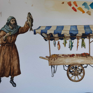
For the England section, I designed a medieval street scene set in 1325. I began with rough ink sketches of the townspeople, followed by layered drawings of the surrounding buildings. Contrary to popular belief, medieval architecture was often quite colourful, traces of paint have been discovered on cathedral facades, so I reflected this by painting certain architectural elements in bright tones. However, to retain the atmospheric, “medieval” feeling that we associate with the period today, I limited most of the colour to the wooden beams of the houses, striking a balance between historical accuracy and visual mood.
The French spreads extend the ochre valleys of Roussillon in the south of France, where towering cliffs of ochre radiate a warm orange hue. This natural pigment is still mined there today.
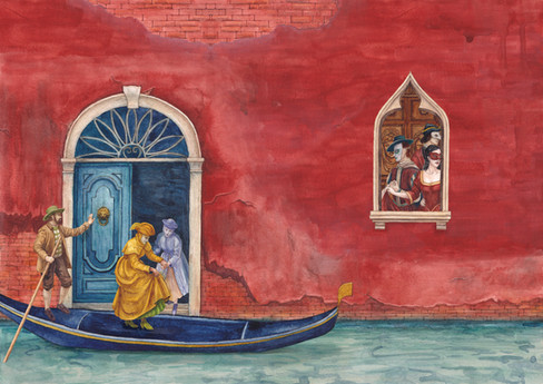
Next, the Italian spreads depict Venice, with its deep Venetian red walls. Venetian red is a natural pigment sourced from the hills of Veneto, just outside the city. As a major centre of trade and culture, Venice played a pivotal role in the movement of pigments and materials across medieval Europe and beyond.
The Leviathan spread continues the story aboard the ship that Adalina and Eggbert take across the Mediterranean. To capture an authentic sense of a medieval vessel, I visited Bristol Harbour to study The Matthew, a replica of a 15th-century ship.
In Lebanon, the spreads celebrate Tyrian purple, the rare dye derived from murex snails. The design continues the shell motifs from the book’s interior and even hides a small, sneaking snail behind the pocket.
Finally, the journey concludes in Afghanistan, where the characters reach the stone summit to collect ultramarine, the prized blue pigment that inspired their entire adventure.


Cover Design
Once the six inner spreads were complete, I moved on to the outer cover. As the story begins with the creation of a manuscript, I wanted the cover to reflect this moment.
I depicted Adalina and Eggbert, the central characters, in the style of the Virgin Mary and Baby Jesus draped in a robe of ultramarine blue, the colour central to their quest. The rest of the cover features an artist’s workbench scattered with tools and pigments, symbolising creativity and craftsmanship.


Pattern Design
For the background of my cover, I created a seamless repeat pattern, which I later adapted into a range of surface pattern designs.


Printing and Assembly
I first created a prototype using my home printer to test alignment and construction.


The Final Book
The final inner spreads were printed on SRA3 140gsm cartridge paper, chosen for its firm matte quality that supports the engineered pockets. The pockets themselves were printed on A4 and carefully hand-cut. The outer cover was printed on 220GSM cartridge paper. All elements were printed using the laser printer. Precise scaling was vital; even minor shrinking during printing would prevent the components from fitting together correctly.


Final Reflections
I’m very proud of the finished result. Bringing the entire collection together within The Book of Books has created a cohesive and immersive object, one that feels reminiscent of the medieval manuscripts I studied in Bristol Library’s Special Collections, yet reimagined through contemporary paper engineering.
The project now feels complete: large, tactile, and full of life. I’m really grateful to the Gane Trust for supporting this development and look forward to sharing the finished work at upcoming exhibitions, art fairs, and across social media.


Comments