
Extended study
- ripleygosling11
- May 31, 2025
- 10 min read
Updated: Jun 1, 2025
Continuing from preparation for Extended Study - colours of the silk Road
In preparation for Extended Study, I began developing my project Colours of the Silk Road. During this earlier phase, I focused primarily on research, building the narrative, and starting the zine series. This groundwork gave me a solid foundation and a clear direction for how to expand and develop the project further in Extended Study.
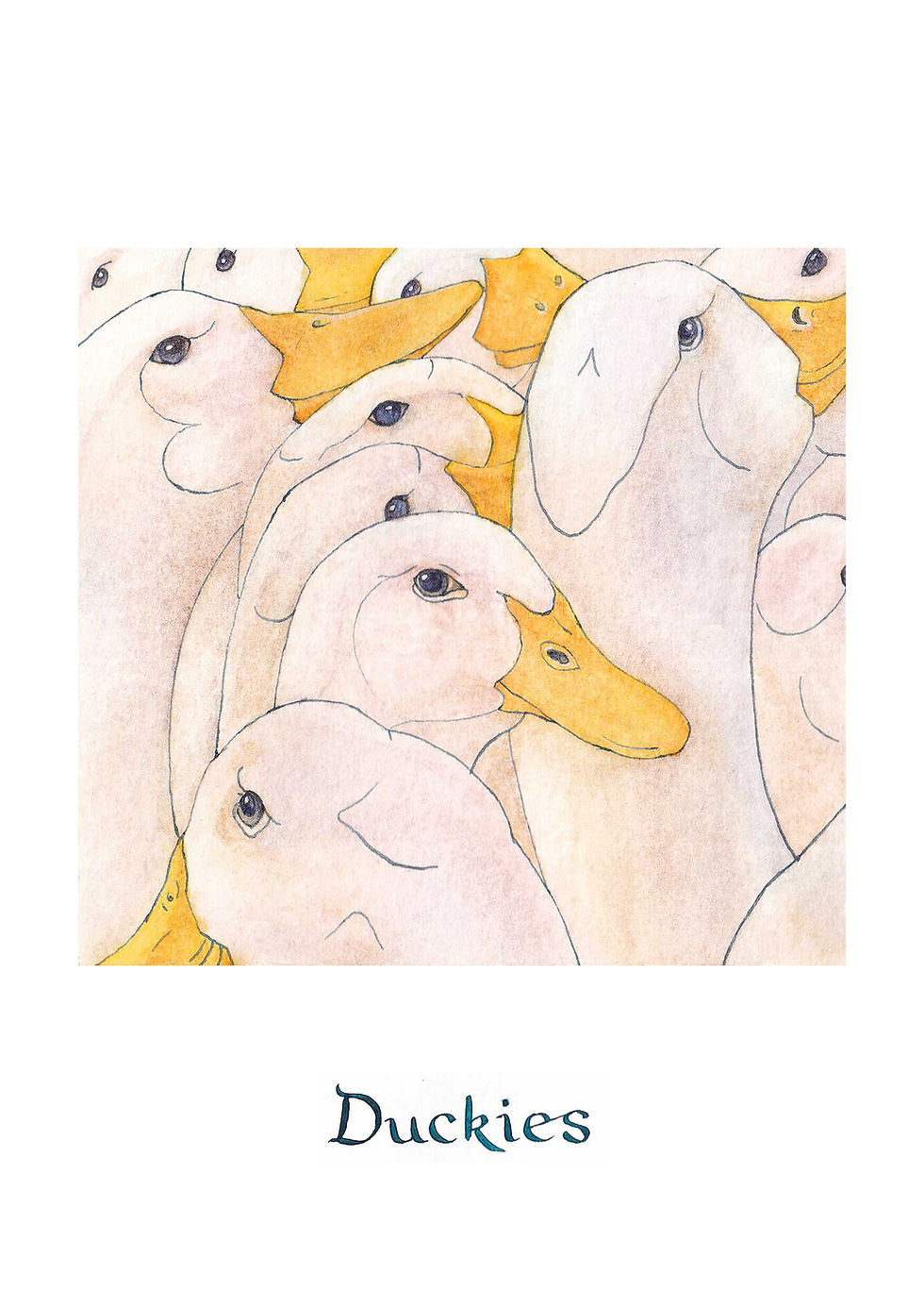
The Priory - UK
The first two zines I created during the preparatory module, The Priory and The Leviathan, have since been revised. The Priory now features hidden magnets in the cover, allowing the full panoramic building to unfold. I also adapted the content into a comic-style print using archway window panels. This zine was printed on 160gsm cartridge paper, which provided enough structure for the building to stand upright while still folding smoothly.


final Zine

The Levaithan
The Leviathan has been updated to include a new pattern inspired by birds and fish found along the Mediterranean coast, the location where Adalina and Eggbert encounter the creature. I used 120gsm cartridge paper for the best balance between flexibility and quality, though GF Smith Zen paper produced the most crisp and professional result. Like The Priory, this zine was also adapted into a print format.


Final Zine


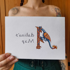
In the preparatory module, I also painted a map depicting the journey of Adalina and Eggbert. I have since transformed this into a Turkish map fold book, adding compass and navigation details, illuminated lettering on the cover, and a hidden pattern within the folds of the map itself. This was also printed on 120gsm cartridge paper. Initially, I was going to add decorative borders to the cover but following tutorials I went for a more minimalist design.


final zine


New Zines
The remaining zines in the series to complete were France, Italy, Lebanon and Afghanistan.
France
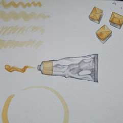
For France my intention was to highlight the process of finding pigment and making paint. Adalina joins Hildegard of Bingen (a medieval nun, pilgrim and artist) and together they collect yellow ochre. The outer slip features two full spreads showing the ochre valley and mine. The inner zine explains how to make watercolour paint using foraged ochre pigments. This recipe is tried and tested. I collected clay earth from a molehill in Ashton court and using the recipe created my own watercolour paints. I wanted to be true to what was available in medieval times. Modern recipes recommend using glycerin and honey however my recipe uses just honey as a humectant which I found successful.


Paint making
Having never made paint before I thought I'd best attempt it before making a zine detailing how to do so. First, I went to Ashton Court to collect clay earth. I took several collections from different sites, yellow ochre stones, red forest earth and red molehill earth. I mixed my binder solution using natural ingredients, gum arabic and honey. I ground the earth using a pestle and mortar and tried to remove as many small stones as possible. This turned out to be almost impossible. I ground them as smooth as I could and made a volcano shape on a glass palette. I then added 5ml of binder and mixed with a palette knife. I continued adding binder until it reached a yogurt-like consistency. I then used the muller to bind the pigment to the binder and swatched it as samples. Eventually I decided I liked the outcome and left the paint pans to dry on the windowsill. Once they dried I found they had cracked and next time I would use much more binder. The paints are also grainy to use and could use more grinding. However the pigments are strong and if you don't mind a rustic effect they work well. I would like to refine this process.


The recipe zine contains two spinning covers showing movable pestle and mortar on the front and movable paintbrush on the back. Following tutorials I edited the slip cover illustrations. For the outer bird cover I removed a tree that broke the compositions and reduced the strength of the line work that was too overpowering, Adalinas dress got toned down too. For the inside Ochre mine scene I changed the scone fires to be darker in the background as they were attracting the eye too much and I wanted the focus to be on the characters. Printed on 120 GSM Cartridge Paper.


Final zine


Italy
The Italy zine, we follow Adalina and Eggbert to Venice and highlight Venetian red as the featured pigment. The cover features a cut-out window that reveals a glimpse into a ballroom scene. As the reader turns the pages, dancers appear in layers, gradually revealing Adalina and Eggbert as they approach a mysterious door. Each dancer page is double-sided, with the reverse of each character mirrored on the back, creating the illusion of moving through a crowd. At the end of the zine, Adalina and Eggbert discover a hidden mask maker, revealed behind a pulley door mechanism.


This zine went through several revisions to ensure precise alignment. My initial rough mock-up used a piano hinge structure and tunnel book-style cutouts for the dancers. The final page features a door with a pull tab that transforms to reveal a mask maker and a vendecolori (pigment merchant). I tackled the pull-tab scene first, as I was running short on time and wanted at least one finished section to represent Italy in the exhibition. Early versions of the illustrations inside the door were slightly too small, revealing unwanted white edges. I resolved this by enlarging the artwork and adding a brown textured background to mask the cutout edges.
Once satisfied with the pull-tab mechanism, I turned to the ballroom crowd scene. I painted the front-facing figures first, then traced and flipped each outline to create their reverse sides. After completing the paintings, I scanned and refined them in Photoshop. For the cover, I designed a Venetian red brick façade with an arched window cut-out, framing the scene inside. Aligning these layered pages was challenging, and I attempted a standard stapled zine format at first, but the intricate artwork required more precise registration than the stapled method could provide.
I ultimately returned to the piano hinge binding, which offered greater control over alignment. This required repaginating the entire book, as the page order differs for hinge binding. Each page was folded and adhered into a concertina spine. I encountered issues with InDesign during this process, specifically, a bleed setting that had become unchecked, resulting in cropped artwork in early prints. Once fixed, I finally achieved the alignment I was aiming for.
I also experimented with different paper stocks for the hinge: vermillion cartridge paper and deep red Canson paper. The cartridge paper folded well and adhered cleanly but didn’t match the cover colour. The Canson paper was a perfect colour match but proved difficult to glue and created a bulkier spine. I also tested dowels and straws as hinge rods, dowels were too slim and created a loose bind, while straws fit snugly and looked better, though they may be less durable over time.
The zine is printed on 120gsm cartridge paper, which offered the best balance between flexibility and print quality for the detailed illustrations.


Final Zine


Lebanon
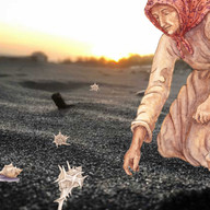
In Lebanon, Adalina and Eggbert wash ashore after being stranded by the Leviathan. To convey the feeling of regaining consciousness, I used layered tracing paper in the first spread. As the reader peels back the translucent pages, a full-page illustration is revealed, someone collecting snails along the shore. The tracing layers also include narrative text describing how the characters are found and taken home to recover.
The following spread explains the ancient process of creating Tyrian purple, made using the snails collected in the previous scene. This dye was so costly and labour-intensive that it was traditionally reserved for royalty. I found that the tracing paper reveal worked well to introduce the zine and bridge the narrative from The Leviathan into the next stage of the journey.


Visually, I feel this zine’s visual language is a bit inconsistent. I wanted to incorporate Islamic pattern motifs to reflect the Lebanese setting, so I designed the cover and several spreads using architectural archways, shell shapes, and botanical elements. However, two of the interior spreads are full-bleed illustrations, and they feel slightly disconnected from the archway pages.
During the painting process, I realised that my original depiction of sand wasn’t working visually. I made the decision to change the first spread from a beach scene to a rockpool setting instead. This revision ended up being one of my favourite spreads in the zine, and I’m glad I followed my instincts to rework it.
For printing, I tested several sizes, A4 felt too large, and A6 too small, so I settled on A5, which felt just right in terms of scale and readability. The zine was printed on 120gsm cartridge paper, which supported the tracing paper layering and maintained good print quality throughout.


Final Zine


Afghanistan
In the final zine, Adalina and Eggbert reach the conclusion of their pilgrimage. I wanted this moment to feel transcendent, reflecting the spiritual fulfilment and reverence they would experience at the end of their holy journey. To evoke that sense of awe, I took a more conceptual approach to the mine setting.
The real lapis lazuli mine in the Sar-e-Sang valley of Afghanistan is a dark, dangerous, and still-active site, where miners work in treacherous conditions. In contrast, I reimagined the mine as a luminous, marble-like space, bright white and serene, with architecture inspired by mosque interiors. This choice was intentional, aiming to reflect elements of authentic Afghan culture through sacred architectural forms and rich veins of ultramarine running through the rock.
The zine underwent several revisions to perfect the composition and alignment of the characters. I designed it as a tunnel book, carefully placing Adalina and Eggbert at the centre, the first point of focus when looking through the cut-out. Behind them, miners can be seen collecting ultramarine, drawing the viewer’s eye deeper into the scene.
I tested various paper stocks for this structure and found that 250gsm cartridge paper offered the ideal balance of strength and flexibility to support the layered tunnel design without warping or collapsing.


Final Zine


The Book of Books
For my final piece, I designed a "book of books" to house my zines and guide the reader through them in the correct order. Each page features a double-page spread of illustrations with a pocket to securely hold each zine. The cover depicts the manuscript the characters are working on, the item requiring ultramarine, the central focus of their quest. This part of the project is currently at the rough dummy book stage, and I hope to complete it after the course. For the show I displayed the books in order and wrote an introduction to the project to guide readers on the journey.


The Final Pieces
Other work
Editorials
I revisited a previous editorial piece that was originally created digitally as I wasn’t happy with the style, I didn't feel like it represented me as an illustrator. To address this, I reworked it using ink to sketch out the characters. Although I wasn’t completely satisfied with the final result, it felt like a more honest reflection of my artistic identity.


For the next editorial brief, I decided to use watercolour, my favourite medium. I chose a simpler, more graphic image that allowed me to work more quickly. One of the challenges with my earlier editorial was the time pressure, as most of my illustrations usually take weeks to complete. This new piece features a portrait, a graduating figure, and a minimal background. By limiting the number of elements, I found the process more manageable, and I was able to finish it faster than the digital version. This mock editorial was created for a New York Times article titled Can’t Talk, I’m Busy Being Hot by Danya Issawi.


Meow meow!
I created a mini 2 panel comic for Picture Hooks’s competition, Meow? Meow! The brief was to illustrate a cat’s before and after scenes on a plain background. Artwork below.


poster design
D&AD
I responded to a D&AD New Blood brief set by The Original Morris & Co. You can find a full breakdown of my project on the blog post linked here. Below are a few highlight images showcasing key moments from the project.


Bristol Short Story Prize Cover Design
Using an existing painting I created of doorways in and around Bristol, I designed a cover for the Bristol Short Story Prize. You can see my submission design below.


Evaluation
Overall, I feel this module was very successful. I felt fully immersed in my project and am proud of how I brought my vision to life. I pushed myself out of my comfort zone by exploring interactive novelty book design, something I thoroughly enjoyed and hope to continue pursuing. While it was a risk to experiment with a different novelty element in each zine, I believe it paid off; the final outcome is far more engaging and memorable than the standard book or graphic novel I originally envisioned. That said, I’d still like to adapt the project into one of those more traditional formats to make it more publisher-friendly.
Another valuable part of this project was my first experience with making paint from foraged pigments. This hands-on process gave me a stronger connection to historical artists and deepened my understanding of their methods, which helped inform the narrative. My France zine includes a pigment recipe, and it felt important to actually test it as part of the storytelling process.
My original plan was to house the zines within a “book of books,” but due to time constraints, I decided to focus on completing the individual zines. I’m glad I made this choice, as I was able to finish all the zines and tell the complete story for the final show, something I didn’t think I’d manage earlier in the project. I’m now planning to create the “book of books” over the summer, in time for Zinezilla, where I’ll be tabling in September. I was also awarded the Summer Scholarship, which will support the development of this work and help me learn how to promote and market it.
I carried out several print tests, and found 120gsm cartridge paper to be the best all-rounder. However, if cost weren’t a factor, I’d love to print the final versions on GF Smith Zen paper, it produced the crispest results with minimal visible fold lines.
In future iterations, I’d like to rewrite parts of the project to create more cohesion. At the moment, the mix of adventure narrative and pigment history can feel slightly jumbled. I think this would be improved by housing the zines together in the final book format.
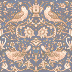
Alongside this project, I also completed a D&AD brief for The Original Morris & Co., which asked for a social media campaign. As I love visual storytelling, I chose to respond with an illustrated zine that tells the story behind the Strawberry Thief pattern using watercolour panel scenes. I also experimented with fabric-printed books and wallpaper design. While my work may not have met the strict expectations of the brief, it felt authentic to me, and I plan to include it in my portfolio.
In conclusion, this module has been very successful. Colours of the Silk Road gave me the opportunity to paint a wide range of scenes and learn from both successes and challenges (such as the difficulty of painting sand!). It gave me the confidence to pursue interactive book design, something I would’ve been too daunted to try otherwise. The Strawberry Thief project introduced me to commercial design and social media work, even encouraging me to step in front of the camera. The experience and advice I’ve gained throughout the module have been invaluable, and I’m excited to keep developing this work in the future.


Comments