Nonsense Poems
- ripleygosling11
- Nov 4, 2024
- 8 min read
Illustrating the Impossible: A Journey Through Nonsense Poetry

My journey into nonsense poetry began in a writing course with Julia Donaldson over the summer of 2024. Part of the course explored Edward Lear's nonsense poetry, and I found myself drawn into the peculiar world of made-up words and impossible creatures. What started as a simple writing exercise soon blossomed into something more significant as I penned three original nonsense poems: "The Snoodlesnout," "The Simperviper," and "The Snaffaloo." Each poem emerged from a different corner of my imagination, drawing on fairy tales and dreams to create their own surreal worlds.
But as I sat with these newly created worlds, a fascinating challenge presented itself: how does one illustrate words that don't exist? How do you give form to creatures born purely from linguistic play? This question became the driving force behind my project.
The Snoodlesnout

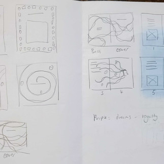
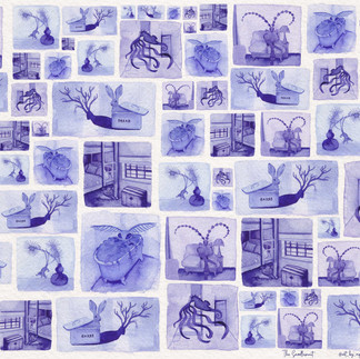
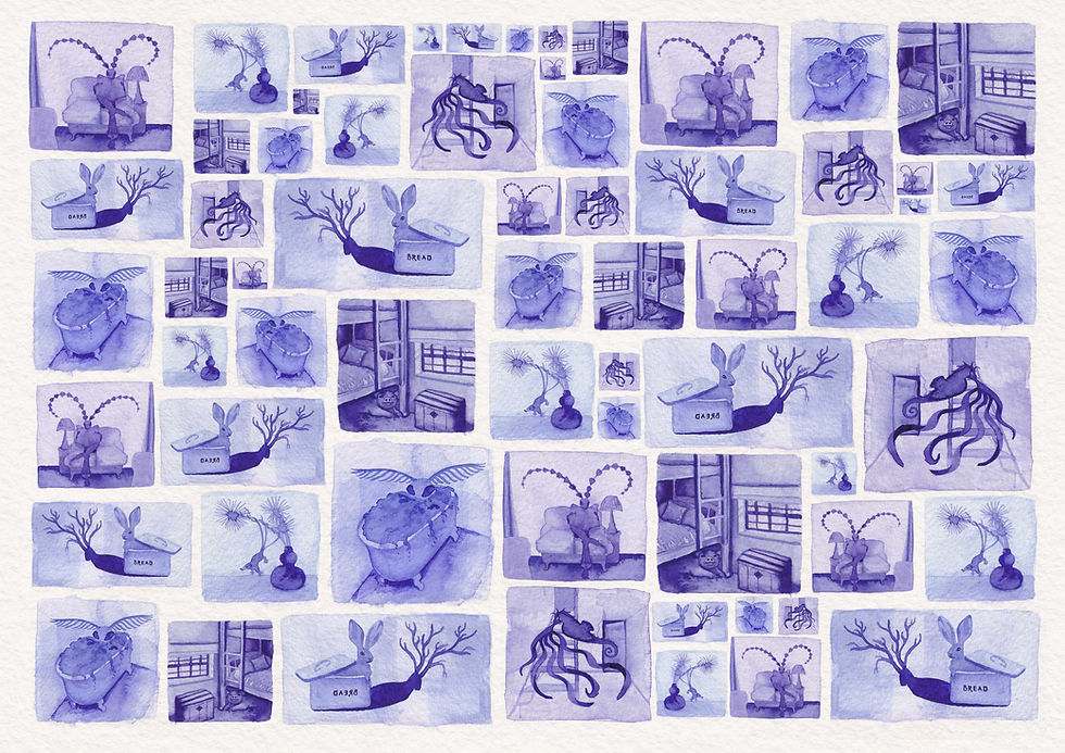
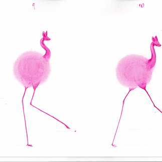
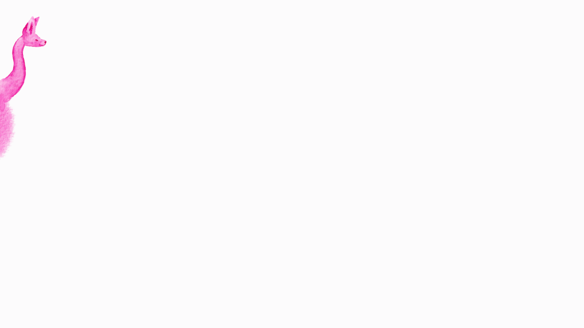
I began my initial explorations into this question with "The Snoodlesnout," a tale of a persistent, mischievous creature who won't rest until its victim surrenders to a joyful dance. My first instinct was to work in A6 zine format, allowing the intimate size to mirror the personal nature of the story. I like working with limited colour palettes as it adds interesting restrictions and can help set atmospheres easier. I chose to work in a purple monotone colour palette, reflecting the dreamy quality of the story.
My creative process evolved through several distinct stages:
Initial Concept Development:
Creation of abstract shapes and blooms
Adding appendages to abstract shapes
Research and reference gathering for animal features
Character Development:
Combining various animal features
Creating chimaera-like creatures
Depicting creatures in human activities (reading, bathing)
Technical Production:
Scanning original watercolours
Colour correction in Photoshop
Background removal and PNG creation
Layout development in Procreate
To begin the creative process, I wanted to tap into pure imagination and make sure I was not being restricted by preconceived ideas. Starting with wet paper as my canvas, I let watercolour paint bloom and spread organically, creating ethereal, abstract shapes. These fluid forms became the foundation for my creatures - I watched as the paint's natural movement suggested various body parts, then enhanced these suggestions by adding appendages, limbs, and features taken from various animals. The paint blooms transformed into otherworldly beings.
Below are some sketchbooks, storyboards and macquettes


As my creature collection grew, I wanted to ground these fantastical creatures in a relatable context. I depicted them engaged in human activities such as reading newspapers, taking baths, and going about daily life. This juxtaposition helped establish the peculiar yet familiar world of the Snoodlesnout.
The next phase involved careful planning of the zine's structure. I created storyboards to experiment with different layouts and typography styles. The decision to create double-sided folding zines emerged from both practical and aesthetic considerations - the compact A6 format accommodated the poems' length, while the reverse side offered space for a surprise poster element. I tested these ideas through several physical mockups.
First Zine Editions


The final technical process involved moving into digital methods. After scanning my watercolour paintings, I refined them in Photoshop, colour-correcting and removing backgrounds. Converting these to PNG files allowed me to overlay elements as layers. Moving into Procreate on the iPad offered more intuitive control over composition. Though I initially combined creatures and scenes within the zine's interior, I later refined this approach - placing the creatures dancing around the internal pages while reserving the full scenes for the poster side, creating an element of discovery as readers unfold the zine.
Final Zine Editions
Front:

Reverse:


I printed the zines on 120 and 140 gsm cartridge paper and both were nicer than the matte paper on which i had originally printed. i think i prefer the stability of the 140gsm over 120gsm. the text came out too small so I will reprint them at a larger size.


Please find a digital version below.
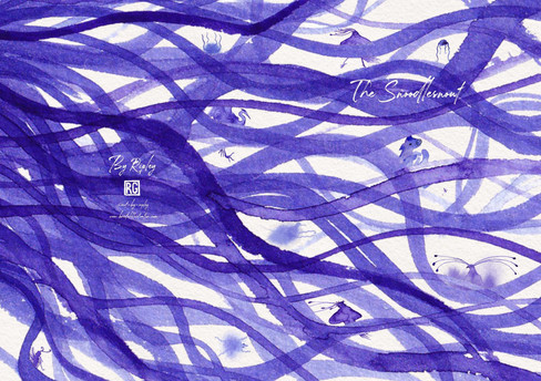
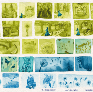
The Simperviper

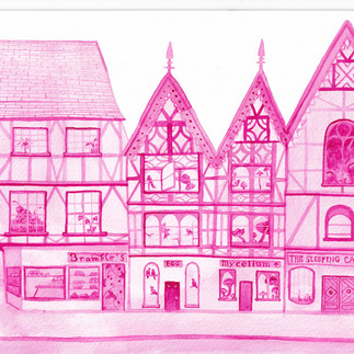
For "The Simperviper," set in the troubled town of Winterwaste, I built upon these techniques while exploring new territory. The story's darker themes demanded different approaches:
Two-tone Colour Palette using overlay technique for depth
Texture Experimentation
The Simperviper's world demanded a distinctly different atmosphere from the playful Snoodlesnout. Set in the troubled realm of Winterwaste, this tale of corruption and redemption needed its own visual language. I chose an acidic green as the dominant colour, its unsettling tone capturing the serpent's malevolent influence. This would gradually transition into restorative shades of light blue as Queen Cinderline's sacrifice restores balance to the world.
In developing the Simperviper's world, I wanted to push my experimental techniques further. While working with wet paint, I began pressing bubble wrap, cling film, and found objects into the surface. As these materials lifted away, they left behind intricate patterns and textures. I think this helped to capture the otherworldly atmosphere I was trying to create.
Below are some sketchbooks, storyboards and macquettes


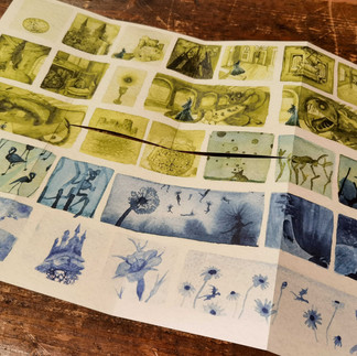
first edition zines


Following the framework established with the Snoodlesnout zine, I began digitising and compositing these textured pieces. However, the initial layouts felt crowded, with characters and scenes competing for attention and I reconsidered the zine's structure. I decided to create a similar journey through the zine itself - keeping the interior pages focused on character studies while reserving the full scenes for a dramatic reveal in the poster side. This approach allowed the acidic green to gradually yield to restorative blue tones as readers progress through the piece, mirroring Queen Cinderline's transformative sacrifice.
Final Edition Front

final edition Reverse

Individiual zine spreads


Along with the zines, I played with several different layout ideas for the poems, departing from a traditional folded zine. These included making “dreamscapes” and single page poems where the story was told in more of a comic book style.
These zines i also printed onto 140 and 120 gsm paper, with 140 being my preferred choice. For the simperviper the 11 point type came out nice and readable.


Poster Poems:


The Snaffaloo
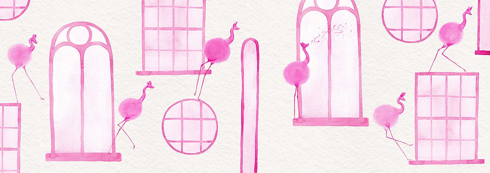
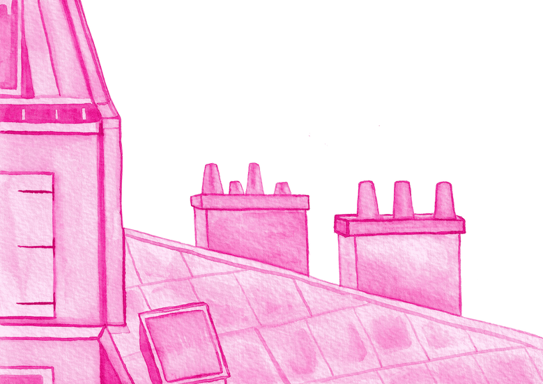
The Snaffaloo's story, set in the town of Wimberton, where the Snaffaloo's gentle song lulls residents into peaceful slumber each night, called for a softer, more ethereal approach. I began with a palette of pink hues, and let the watercolours float and merge, but this time focusing on creating more dreamy, cloud-like forms. The more I considered the story, the more it seemed to demand movement, sound, and a more immersive experience. The project naturally expanded beyond traditional print media to new possibilities and I began exploring various digital and physical methods:
Multimedia Development
Animation Techniques:
Time-lapse painting recordings
Frame-by-frame watercolour sequences
Character movement studies
Environmental animation elements
Real-World Integration:
Acetate printing of characters
Location photography around Bristol
Photo sequence animation
Mixed media compositions
Interactive Elements:
Tunnel-book
My first venture into animation began with simple experimentation. After watching tutorials, I was inspired to try bringing my paintings to life. I started by storyboarding quick rough sequences, imagining how my watercolour creatures might move and interact with their surroundings. The concept that excited me most was the idea of a character literally coming alive on the page - breaking free from its painted constraints to explore both its illustrated world and our own. Something akin to "Animator vs Animation" by Alan Becker (https://www.youtube.com/watch?v=npTC6b5-yvM)
Below are some sketchbooks, storyboards and macquettes


Timelapse animation comes alive
Working with animation required a more intensive approach. Wanting to keep the watercolour aesthetic of zines, I painted each element of the story separately: backgrounds of streets and windows, individual frames of the character running and jumping, environmental details like falling rain and swirling leaves. While my inexperience with animation initially led me down some time-consuming paths - creating walking sequences and world-building elements that weren't strictly necessary for the story - these explorations helped me understand the fundamental principles of bringing static illustrations to life.
Character animation tests


But perhaps the most intriguing development came from an impulse to break down the barrier between illustrated and real worlds. I explored various formats: time-lapse recordings of my painting process, frame-by-frame digital animations based on watercolour elements, and POV videos that put viewers in the character's position.
Photography series animation
photography series animation static landscape
Point of view
By printing my character animations onto acetate, I could literally insert my creatures into reality. I took these transparent figures on adventures around Bristol, photographing each frame of their movements against real-world backdrops.
Photography series:


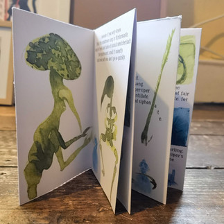
Peepshow / tunnel book
Each medium revealed new possibilities for storytelling. One possibility I explored was inspired from my research into the peepshow-style tunnel books from the Victorian era. I created one for The Snaffaloo. This traditional form of paper engineering seemed particularly fitting for a story about a creature glimpsed through windows at night.
zooming animation of tunnel book
Tunnel book layer illustrations:


This format proved particularly effective for building anticipation and helping the viewer relate to the story - the physical act of peering through layers connects you with the way Wimberton's residents might search the night sky for their missing musical creature. The tunnel book's dimensional nature allows the story to exist somewhere between illustration and sculpture, creating an intimate viewing experience that feels almost like looking into a miniature theatrical set.
Finished tunnel book and macquettes


The technical challenges of animation pushed me to refine my approach to colour and composition. Following feedback from tutorials, I tried to create a more dynamic atmosphere by leaving the restriction of a single colour. Working with overlaid colours rather than flat tones added depth and coherence to the scenes.
Colour palette tests


I found the more I worked into the scene with contrasting tones, the more alive it started to feel. With more time I would convert all the scenes to this colour palette and create a series of animated sequences and zines.
final colour palette


As the project expanded across different media, I began to see how these various approaches might complement each other rather than compete. The traditional zines could provide an intimate, tactile experience of the story. The animations could capture the fluid movement and playful spirit of the characters. The real-world photographs could challenge viewers' perception of what's possible and impossible. Together, these different elements could create a rich, multi-layered experience of these nonsense worlds.
Looking ahead, I've identified several promising directions for future development:
Future Directions and Refinements
Technical Developments:
Interactive digital experience development
Audio element integration
Stop-motion animation sequences
Silent movie-style text card incorporation
Content Expansion:
Complete anthology of all three poems
Expanded character animations
Additional environmental designs
Narrative interweaving
Design Refinements:
Enhanced colour palette exploration
Improved layout design
Better text integration
Refined character-scene relationships
I began envisioning two pathways to final digital outputs:
An interactive digital experience that would weave together these different elements - something between an animated website and a video game, where readers could explore the story through clicks, scrolls, and perhaps even some other creative input.
A single film, which stitches together all the elements - animations, POV videos, timelapse and footage of exploring the printed elements such as the tunnel book and posters. The challenge here is to achieve this in a seamless way.
What began as an exercise in illustrating impossible creatures has evolved into an exploration of how different media can capture different aspects of imagination. This journey from simple nonsense poems to multimedia exploration has revealed that illustrating the impossible is less about depicting nonexistent things and more about finding ways to make the impossible feel tangible. Each new technique or medium has opened fresh possibilities, suggesting that this project as it stands is very much not a completed work and more so the beginning of something larger.
I envision creating an immersive experience that blends different media seamlessly: hand-painted animations dissolving into real-world footage, POV shots moving through streets, and intimate moments peering through the tunnel book's layers.
I found myself drawn to the idea of incorporating audio elements, silent movie-style text cards, and stop-motion sequences. The possibility of adding narration opened up new questions about how to balance the written poem with visual and auditory elements.
Final narrated animation sequence
Alongside this digital development, I plan to create a print anthology of all three poems, honouring the tactile nature of the original project. This physical collection would complement the digital experience, offering readers a tangible way to engage with these nonsense worlds. By embracing both digital and traditional approaches, the project could create multiple points of entry into these fantastical realms, each medium contributing its unique strengths to bring these stories to life.


Comments