
Medieval Manuscript Project
- ripleygosling11
- Jan 14, 2025
- 15 min read
Updated: Mar 31, 2025
This project began with a deep passion for medieval manuscripts. I had been creating manuscript-inspired art pieces and wanted to expand this into a story that captured the look and feel of a medieval manuscript. My goal was to create something both informative and engaging, a story that could bring the beauty and history of manuscripts to life.
I decided an adventure story would be the perfect way to highlight different cultures around the world, showcasing various manuscript styles along the way. As I developed the plot, I delved into extensive research on late medieval life, focusing on the period between 1200 and 1500. This led me down several fascinating rabbit holes, including the making of manuscripts, the origins of pigments, female scribes, and the lives of late medieval women.
While I loved all these themes, I realized that to create a concise and compelling story, I needed to focus on one. Attempting to include everything felt cluttered and overwhelming. Ultimately, I decided to write a short story or graphic novel, with plans to later adapt it into a children's picture book. This way, the project could grow and evolve while staying true to its medieval inspiration.
I discovered a wealth of online records of medieval manuscripts from all over the world. These ranged from religious texts and bestiaries to horse care guides, books of poetry, alchemical scrolls, and more. Each one was utterly fascinating. However, as books are tactile objects, I found that viewing them on a screen lacked the sensory connection needed to truly appreciate them.
To bridge this gap, I downloaded and edited many of these manuscripts so I could print them out and hold them. This hands-on approach gave me a much better sense of what the original books might have felt like. I noticed that these manuscripts were often reworked over the years, books were taken apart, added to, or annotated with notes in the margins. Many featured multiple languages, with commentary or interpretations of the text and illustrations layered over time. For example, the Morgan Crusader Bible began as an entirely pictorial manuscript, but over the centuries, numerous hands have added text in various languages, enriching its history.

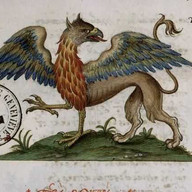
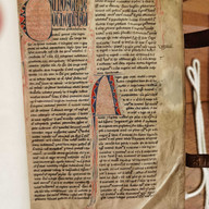
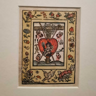
One particularly captivating piece I explored was the Ripley Scroll. Beyond sharing my name, it’s an alchemical manuscript containing a "recipe" for the Philosopher’s Stone—the elixir of eternal life and the ability to turn any metal into gold. Its illustrations are delightfully entertaining. Originally over 10 meters long, I printed mine at about 2 meters, and it’s still an impressive, engaging artifact to study.
ripley scroll:


A0 detectives map
To explore the cultural features of my project, I created an A0 detective-style map of the world, focusing on six key countries highlighted along the journey: England, France, Italy (with an emphasis on Venice), Morocco, Afghanistan, and China. The map showcases various elements from each region, including locations, fashion, mythical creatures, beliefs, characters, manuscripts, and scripts. Adding an interactive twist, I incorporated hidden doorways that conceal secret characters, making the map both engaging and exploratory. The entire piece is crafted using collage.


Initial sketches and roughs:
Initially, I wanted the illustrations in my story to adapt to the styles of the cultures it explores. For example, as the journey passed through Morocco, the pages would take inspiration from Islamic manuscripts, and so on. However, as I tried to weave these different styles into the narrative, it felt disjointed. The pages lacked cohesion and needed a unifying theme. To resolve this, I decided that since the story is presented as the main character’s journal, it should maintain the consistent style of a single manuscript throughout. This approach not only tied the visuals together but also reinforced the personal and immersive nature of the narrative.


Research:
I wanted my narrative to feel authentic to the time and cultures it represents, so I aimed to create a work of faction, fiction grounded in as much historical accuracy as possible. To achieve this, I immersed myself in extensive research.
I read The Book of Margery Kempe, a 15th-century biography written from Margery’s perspective. Kempe was a Christian mystic and pilgrim who embarked on numerous journeys to holy sites around the world. Her accounts were fascinating and offered incredible insight into her experiences and worldview.
I also read Wild by Amy Jeffs, which retells myths and legends from the era, stories that would have been known to the characters in my narrative. A Travel Guide to the Middle Ages by Anthony Bale provided vivid descriptions of various pilgrims’ experiences of travel, helping me better understand the challenges and perspectives of medieval travelers.
To delve deeper into the context of book production, I explored The Medieval Scriptorium: Making Books in the Middle Ages by Sara J. Charles, which outlines the history and craftsmanship behind the creation of medieval manuscripts. Each of these resources helped me weave a richer, more historically informed story.
Inspiring Artists:
I admire these artworks for their aesthetics, content, and storytelling. While most are contemporary, they beautifully explore themes of gods, myths, fairy tales, and the supernatural, concepts I aspire to incorporate into my own work.


Places visited
One of my greatest passions is visiting historical sites, so incorporating this into my project was incredibly exciting. I visited Gloucester Cathedral, renowned for its intricately carved cloister corridors with stunning vaulted ceilings. I also explored Hereford Cathedral, home to the Mappa Mundi and the Chained Library. Seeing the Mappa Mundi, a 13th-century depiction of the world, was hugely inspiring, it offered a fascinating glimpse into how medieval people understood their surroundings.
Gloucester:


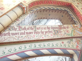


This experience deeply influenced my work. I wanted to illustrate my own map, and understanding the medieval worldview was essential. The Mappa Mundi features biblical sites, mythical creatures, and legendary beasts, which inspired me to include some of my own creations on my map, blending historical inspiration with my own narrative.
Hereford:


The Matthew Ship:
The Matthew Ship is a replica of a 15th-century merchant ship, the kind pilgrims would have used for their overseas journeys. I wanted to include it in my research, so I spent some time sketching it. It was undergoing refurbishment at Underfall Yard, which gave me a unique opportunity to see and sketch the underside of the ship, a perspective not often accessible. Unfortunately, since it was in the yard, I couldn’t go on board, but the experience still provided plenty of inspiration and made for some fascinating sketches!


Morocco
Over the summer break, I went on an incredible trip to Morocco to explore pigments and history. As a historic trade hub between the medieval East and West, Morocco has such a rich and fascinating past.
During my two weeks there, I wandered through vibrant souks (covered markets), visited stunning religious sites, and even embarked on a trip into the desert. In the markets, I discovered unique pigments made from henna, jojoba plants, amethyst, ultramarine, indigo, and Marrakech red ochre. The atmosphere of the pigment traders felt like stepping back in time, unchanged for centuries, and provided wonderful inspiration for scenes in my story.
I brought my sketchbook along and documented so many moments from the journey. From bustling market stalls to the stillness of the desert, the trip was a beautiful blend of history, color, and creativity.


Sketchbook:


Bristol Library
Bristol Library holds a collection of medieval manuscripts, and through a special request procedure, I had the opportunity to view them. To ensure their preservation, the manuscripts can only be handled for a few hours at a time, so I spread my visits over two days. The collection was breathtaking, featuring exquisite religious texts like Books of Hours, Psalters, and a Bible, as well as a fascinating medical compendium filled with entertaining illustrations. Each page was a visual treasure, and the intricate lettering provided endless inspiration for my calligraphy practice. It was an unforgettable experience!


Sketches from the library visit:


london
I recently took a research trip to London to visit the Medieval Women in Their Own Words exhibition, a stunning collection of artifacts and manuscripts created by influential and notable medieval women. The exhibition was filled with stories, songs, letters, treasures, and even the skull of a queen’s pet lion. It offered a vivid window into the rich and complex lives of these women, whose histories are often overlooked. Since this theme has been a key inspiration for my book, I found the exhibition deeply moving. Seeing the actual works of women whose memoirs I’ve read before was an unforgettable experience.


During my trip, I also visited Cornellison’s art shop, a true treasure trove of art supplies. The shelves were lined with pots of pigments and unique art tools that felt like stepping into an artist’s paradise.


While in London, we passed by countless shops with beautifully elaborate Christmas window displays. I was particularly drawn to the vibrant colors and intricate patterns of the Fortnum & Mason windows. Once inside, I discovered I really loved their product packaging, it was full of ornamental maximalism. I made a mental note to myself that I’d love to create something like that one day.


Lastly, I explored the British Museum to delve deeper into ancient and medieval history. The artifacts on display, from fashion and ritual items to weaponry and art, offered a fascinating glimpse into global histories and traditions. It was incredibly enriching and has given me fresh insights for my project.


France Valley of Ochre Application
Techniques practised
In an early manuscript-style art practice, I experimented with the differences between traditional gold leaf application and metallic paints. To apply gold leaf, I began by creating a raised layer of gesso, which I then gently sanded to a smooth surface. Using a funnel to guide my breath, I hydrated the gesso, allowing the gold leaf to adhere to its surface. Once in place, the gold leaf was burnished to achieve its full brilliance. As a beginner with this technique, my application was a little patchy, but it was fascinating to explore this traditional method. I’m excited to continue practicing and refining my skills!
By contrast, the metallic paint application was much simpler. I started with a deep red underlayer to give the gold paint a richer, more vibrant appearance. After the red layer dried, I painted two coats of metallic gold, allowing each layer to dry before applying the next. The process was quick and easy, and the result looked nice, but it lacked the luminous, reflective quality of true gold leaf. This comparison was a fun exploration of technique, and I’m eager to keep experimenting with these materials!
Gold Leaf vs metallic paint:

The Narrative
Central Asia and the Middle east:
The goal for my character is to collect ultramarine in what is now Afghanistan. To set the scene for medieval Afghanistan, I created quick ink sketches of Buzkashi, the country’s national sport, capturing its dynamic energy and horsemanship.


Tutorials
I brought my research and ideas to a tutorial session and received some incredibly helpful feedback. While they appreciated the narrative, they pointed out that attempting to create a full book or graphic novel was an overwhelming task, something I had already been feeling myself. They also reassured me that it wasn’t necessary for this project, which is more about experimenting with new ideas.
Their suggestion was to break it down into smaller, more manageable pieces, such as creating a zine for each location or even assembling a box of collected items, similar to Chris Ware’s Building Stories. This idea really resonated with me. Working in smaller segments felt much more achievable and opened the door to experimenting with ideas rather than being confined to a traditional book format.
It also gave me the freedom to use different mediums for each zine or collection, which was a relief. I had been struggling to make the overall look and feel of the project cohesive, as some mediums weren’t working well together. This new approach feels much more fluid and exciting, and I’m eager to dive into it!
Chris Ware's Building stories:


So! What next?
I researched some artists' book ideas and loved the idea of playing with a books format to tell a story. I discovered pop up houses and thought it would be really fun to introduce my story and characters in a pop up abbey.
Artists books inspiration:


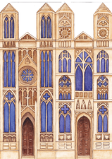
The Priory Pop Up Zine
I created roughs and dummy books to practice my zine concept, ultimately deciding on a 4-page zine that unfolds to reveal a fun abbey book, with the full building viewable at once. While the concept worked well, I made some rookie mistakes during the painting process.
Initially, I sketched out the template and painted the locations directly onto it. However, I realized afterward that a better approach would be to paint the locations separately on individual pieces of paper and then place them into the template digitally. This method would allow me to reuse the locations for future projects and ensure the template stays consistent across all pages.
Roughs, Macquettes and tests:


Painting directly onto the template left room for human error, and as a result, some pages aren’t perfectly identical. Additionally, painting the locations up to the edges of the page created rough edges that needed to be cleaned up later. Next time, I’ll work on separate pieces and assemble them digitally to streamline the process and achieve cleaner, more polished results.
Process:


I test-printed the locations using my template and constructed the pop-up book to see how everything came together. I was pleased with the format and drew floor tile designs to help align the floors of each location with the book’s base. Once finalized, I traced these designs onto watercolor paper and painted them. I also wrote the narrative text in Uncial script, an authentic script from the medeival era. I also decided that I preferred the name of a priory over an abbey and the zine became The Priory. This handwritten script is also in the process of becoming a font.
Calligraphy:


For the characters and furniture, I ensured that each piece fit neatly onto the paper and into the locations. After painting, I scanned and edited them, exporting the final images as PNG files in Photoshop. These elements were then brought into Procreate, where I added shadows and lighting for depth and atmosphere. Once all the components were complete, I exported them and used InDesign to assemble everything into the final template for printing.
Character and location designs:


I test-printed the zine on various paper stocks: 120gsm, 140gsm, and 160gsm cartridge paper. Of these, the 160gsm felt the most sturdy and suitable for the book. The final zine unfolds nicely, and I’m pleased with its overall feel. However, I find that I prefer the larger printed version, as the detailed paintings are more striking and easier to appreciate at a larger scale.
Final spreads:


Final Zine:


Adalina's Map
I set out to create a map that my character might have carried on her pilgrimage. It features references to myths and legends, biblical sites and stories, beasts and monsters, the Garden of Eden, and more. Drawing inspiration from numerous medieval maps, which often included such fantastical and symbolic elements, my map reflects this tradition while also incorporating key locations tied to her journey. However, the map still needs finishing touches, including location names and a decorative border. On the border, I plan to include additional information about the locations to enrich the storytelling.

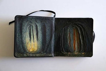
The Leviathan Explosion book
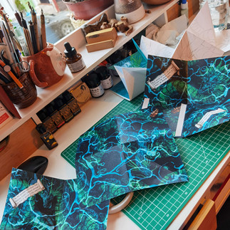
The next chapter of the story I wanted to create focused on the ocean voyage. For medieval pilgrims, seafaring was an essential yet perilous part of their travels. The sea was a mysterious and dangerous realm, believed to be teeming with terrifying beasts and monsters. I wanted to capture this fear of the unknown and the superstitions that shaped their perceptions of the deep. When storms arose, it was often attributed to divine wrath or the work of devils. In my narrative, the ocean is home to serpents of immense size, their bodies writhing in a tangled mass of fangs, scales, and spines, embodying the nightmarish fears of the time.
The scene I am illustrating in my zine portrays a perilous journey through a raging storm. It’s a highly dynamic moment, and I wanted the format of the zine to reflect that energy. I was drawn to the idea of an explosion book—a format that unfolds dramatically with intricate mountain and valley folds. When opened, it resembles the rough surface of a turbulent sea viewed from above, creating the perfect seascape for my voyage.
I was also captivated by the name Leviathan, which evokes the image of a massive, awe-inspiring beast. Its origins trace back to the "late 14c., 'sea monster, sea serpent,' sometimes regarded as a form of Satan, from Late Latin leviathan, from Hebrew livyathan 'dragon, serpent, huge sea animal,' of unknown origin, perhaps from root l-w-h- 'to wind, turn, twist,' on the notion of a serpent's coils. If so, related to Hebrew liwyah 'wreath,' Arabic lawa 'to bend, twist.' Of powerful persons or things from c. 1600. Hobbes's use is from 1651.
An aquatic animal mentioned in the Old Testament. It is described in Job xli. apparently as a crocodile; in Isa. xxvii 1 it is called a piercing and a crooked serpent; and it is mentioned indefinitely in Ps. lxxiv. 14 as food and Ps. civ. 26. [Century Dictionary].”
The weight of this history adds depth to the mythic creatures in my narrative, making them feel as ancient and powerful as the fears they symbolize.
Leviathan Inspiration:

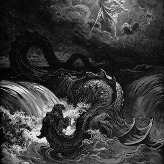
Drawing inspiration from historical depictions of leviathans, like those by Doré, and contemporary depictions, I began designing my serpents. I started with rough sketches to see how they would fit within the unique shape of the zine. The explosion format, while dynamic, proved to be quite challenging to work with. To test the layout, I painted a third of the zine in ink, focusing on outlines and ocean waves, then collaged these elements together. I printed test versions to observe how the design interacted with the folds.
While I was pleased with the serpents, I found the waves too distracting—they pulled focus away from the leviathan. I wanted the creature to feel so immense that it spilled out of the frame, leaving its full size and form to the imagination. I also aimed to create an unsettling ambiguity: does the leviathan have an end? Do all the heads belong to a single beast, or are there many? This sense of mystery was essential to conveying the fear and wonder these mythical creatures inspired.
Roughs and Tests:


Next, I painted watercolor versions of my serpents, using cling film to create a scaly texture on their bodies. I also added ships, hidden within the depths, as if they were the leviathan's previous victims. To bring more variety to the piece, I experimented with a range of textures, incorporating unusual materials into the paint to see what effects they would produce. While many of these experiments were intriguing, only a select few made it into the final composition.
Paintings and Textures:


I printed both A4 and A3 versions on 160gsm paper, but both came out misaligned, which I’ll need to correct in future prints. The A3 version printed too dark and overly saturated, so it will require reprinting, whereas the A4 version had the correct coloring. However, the paper stock is too thick—120gsm would be a better choice to allow for more precise folds. Additionally, the covers need to be slightly larger. Although I included some bleed allowance, it wasn’t enough, and as a result, the covers don’t fold smoothly into the zine. To showcase the full artwork, I also printed an A2 giclée version, which allows the entire piece to be seen in its entirety.
Final Full Illustration:

Final Zine:


Evaluation
This project has gone down so many twists and turns and evolutions throughout its process. I'm very glad it changed from my original goal of creating a graphic novel to a collection of zines, like Chris Ware's building stories. The smaller zines have been more playful to make and allowed for more experimentation. I would love to be able to complete the set and have the whole story in zine chapters, along with maps, collected items and letters etc, all collected in a beautiful display box.
Editorial:
For a text addressing the negative effects of social media, I created this editorial illustration. With only two days to complete the project, I opted to work digitally. However, I’m not satisfied with the outcome, as it doesn’t reflect my personal style. Despite this, I like the concept and found the challenge enjoyable. I’d like to recreate the piece using analog materials to create something I’m proud to share.

Overall Evaluation
Since the last assessment, I’ve worked on a variety of projects, and summarizing them all in just 500 words is a challenge. The summer and the start of Year 3 became a test bed for experimenting with new ideas and techniques. I particularly enjoyed the style I developed for the Cinderella and Aesop’s Fables projects and would love to expand on these in the future. For Cinderella, I'd like to complete a full set of 12 spreads for a children’s picture book, while for Aesop’s Fables, I envision creating a series of posters that bring the stories to life. The Tear Drinkers is a playful concept that I’m excited about but recognize it needs significant further development. The Hong Kong Project was a unique opportunity to document my travels in a sketchbook. I've always loved collecting ephemera during trips, and combining these with sketches, handwritten notes, and collages to create a cohesive scrapbook was really satisfying. Photographing these elements and turning them into a finished publication felt very rewarding, and it’s an approach I’d like to revisit and refine in future projects.
This submission includes two major projects: the Nonsense Poetry Illustrations and the Medieval Pigment Quest. The Nonsense Poetry project was a lighthearted and creative exploration that allowed me to loosen up and have fun building whimsical worlds and creatures. I particularly enjoyed designing scene settings, which gave me plenty of freedom to experiment with different color palettes.
For the first two poems, I created fold-out poster zines, while for the third, I experimented with alternative formats, including animations, tunnel books, and more. By the end of the project, I was satisfied with a few spreads after making some color corrections. However, many scenes remain predominantly monochromatic pink, and I’d like to adjust these to better reflect the blue and ochre palette I later envisioned. I also hope to complete a fully printed version to compile the entire collection into a Nonsense Poem Zine Anthology. While the project was highly experimental, which I loved, the final result feels a bit homemade. Moving forward, I’d like to refine and polish it to bring the project to its full potential.
The final major project was the Medieval Pigment Quest, which I thoroughly enjoyed and would love to continue developing. The research behind this project led me to countless fascinating discoveries, and the techniques I practiced throughout were invaluable. I’ve gained a deeper understanding of artist book production, which has been incredibly rewarding. Exploring unique and creative ways to tell stories has solidified my goal as an illustrator: to be a storyteller. That said, I recognize that, as this was my first attempt at creating unconventional book formats, the final outcomes have a more rustic appearance than I had hoped for. In the future, I’d love to refine these pieces, completing the set of zines alongside maps, found items, and letters from the story, all presented together in a beautifully crafted box. If I were to take this project further, I’d like to adapt the content into either a children’s picture book or a graphic novel, expanding its reach and storytelling potential.


Comments